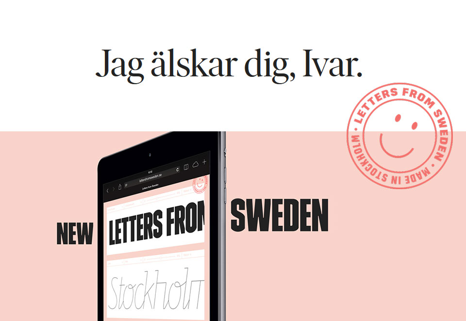
01 Mar Letters From Sweden – I love you, Ivar
No, that is not a way to confess my love for a shelf from a famous Swedish furniture shop. Ivar is one of around fifteen fonts from a successful little type foundry based in a small district near Stockholm called Letters from Sweden.
Göran Söderström started early to work in various design and advertising agencies without having any formal education in design. One of his favourite things was to vectorize badly scanned logos and setting and organizing long, boring texts. Beside his job he soon began to scribble letters and playing with type design. But he never saw any future for this passion and first decided to become a professional music producer.
It didn’t take much time to realise that he was better in type design than in music production and so, after already publishing his fonts through various dirstributors, he founded his own business “Letters from Sweden” in 2011.
Göran Söderström, source: fontstand.com// Something I try to move more and more towards is to make typefaces not so bloody perfect. Typefaces can be more interesting if there is something that looks a bit “off” in them. I guess I’m trying to avoid making boring typefaces, but on the other hand who isn’t? //
The first published font was the sans serif font Siri followed by Trim in 2012, a very straight constructed font inspired by the Danish architect and designer Knud V. Engelhardt (1882–1931). What made “Letters from Sweden” stand out from other foundries was the special feature to type live text on the website. That caused attention.
In the meantime Göran Söderström found a strong partner in Erik Moberg (beside a lot of other designers) and “Letters from Sweden” has become an established but uncommon foundry with clients all over the world.
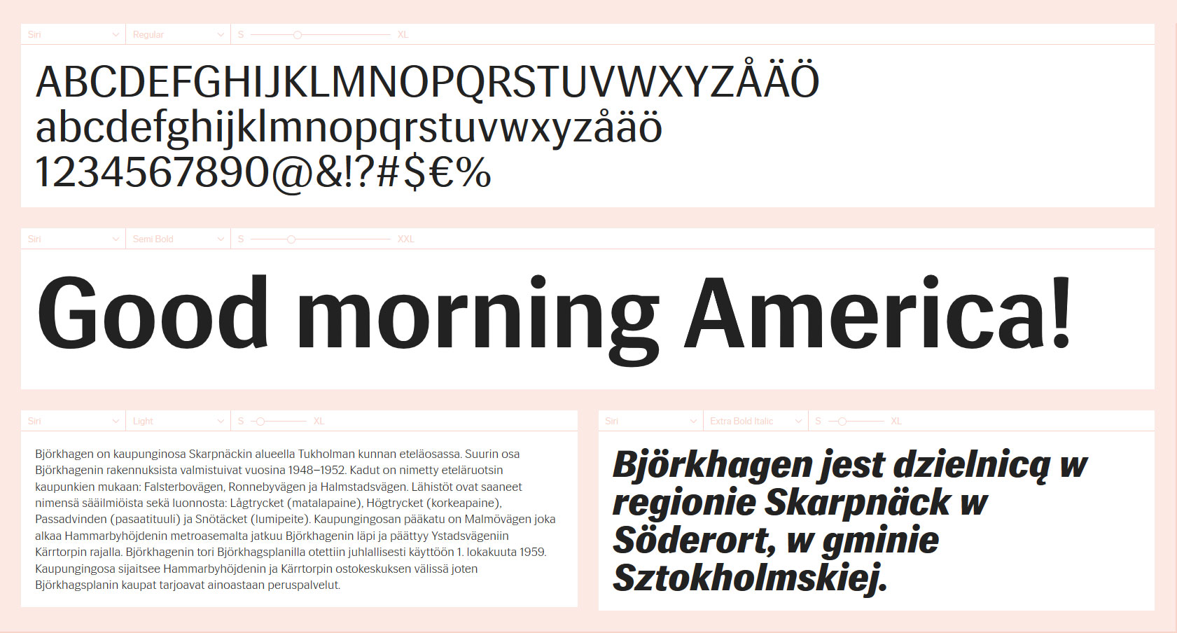 Siri – by Göran Söderström
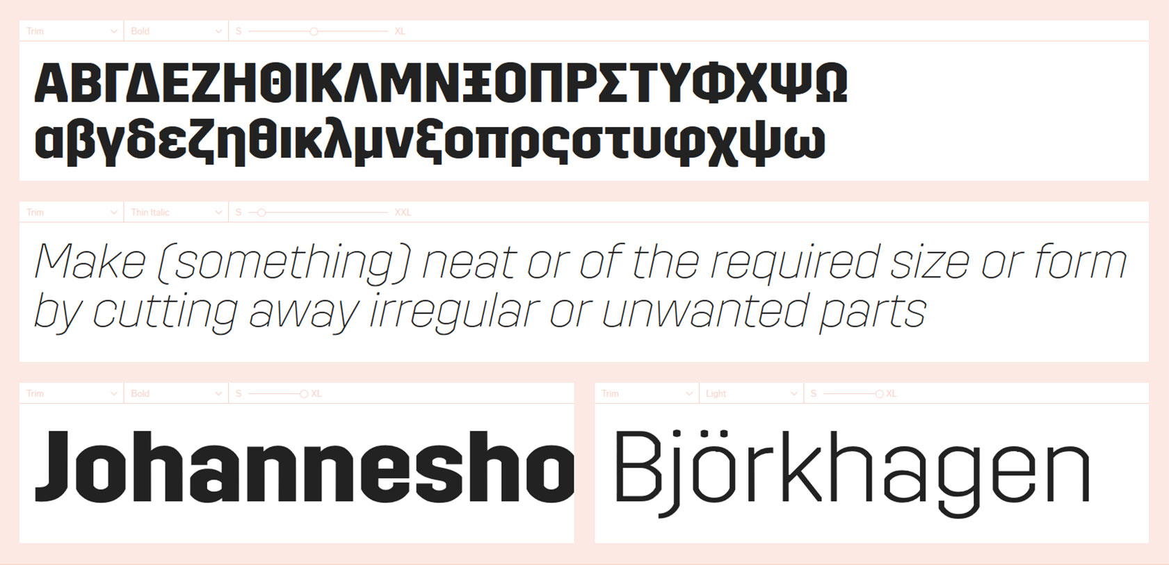 Trim – by Göran Söderström
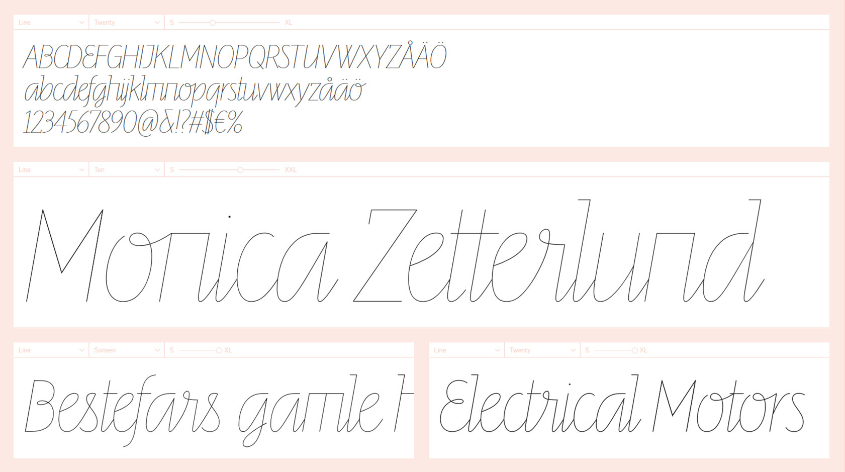 Line – by Göran Söderström