
Client
Deutsche Hämophilie Gesellschaft e.V. (DHG)
Project
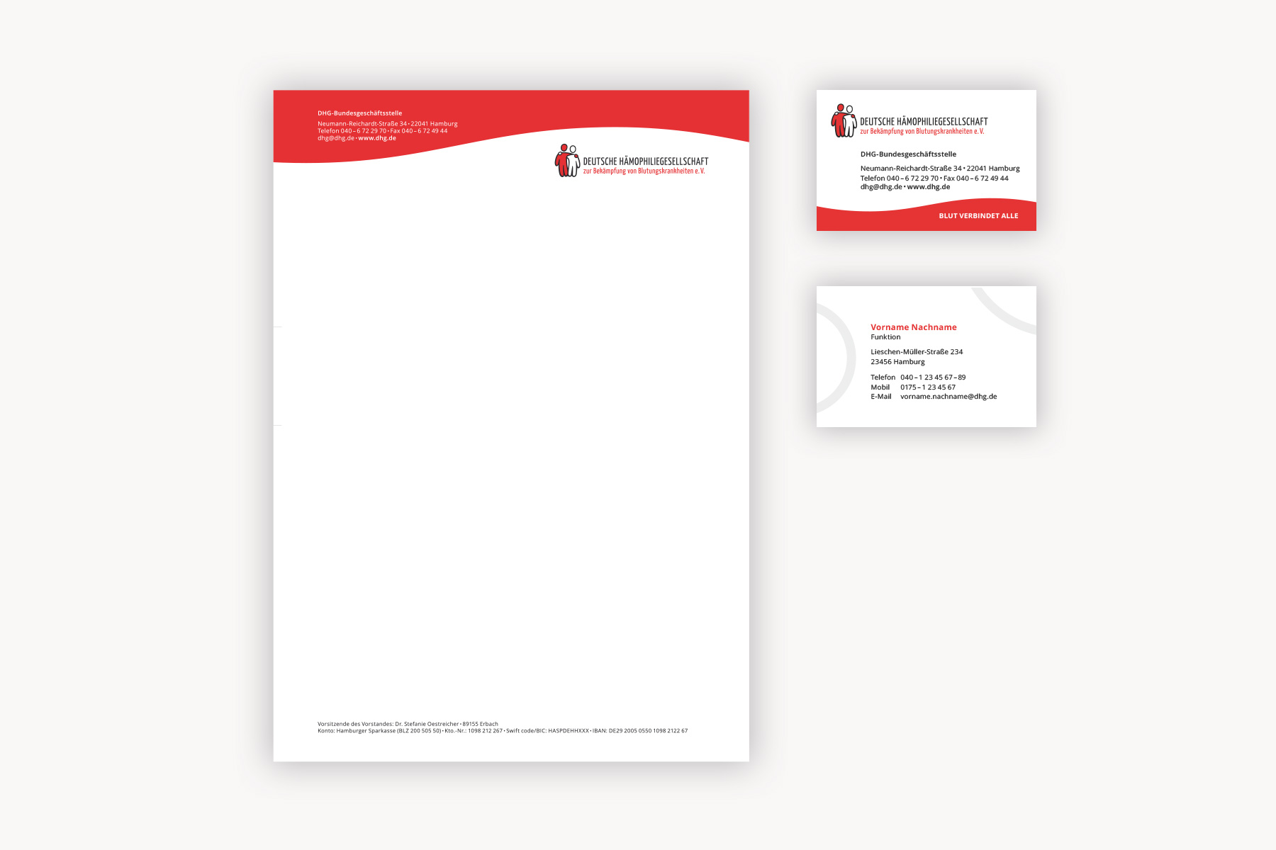
Logo redesign, stationary and templates
Agency
Date
December 2018 - January 2019
Category
graphic designThe DHG – Deutsche Hämophilie Gesellschaft – is a registered association for people with haemophilia and their relatives. It gives information about the desease itself as well as about medication, clinics and surgeries, problems in everyday life, excursions, meetings and much more.
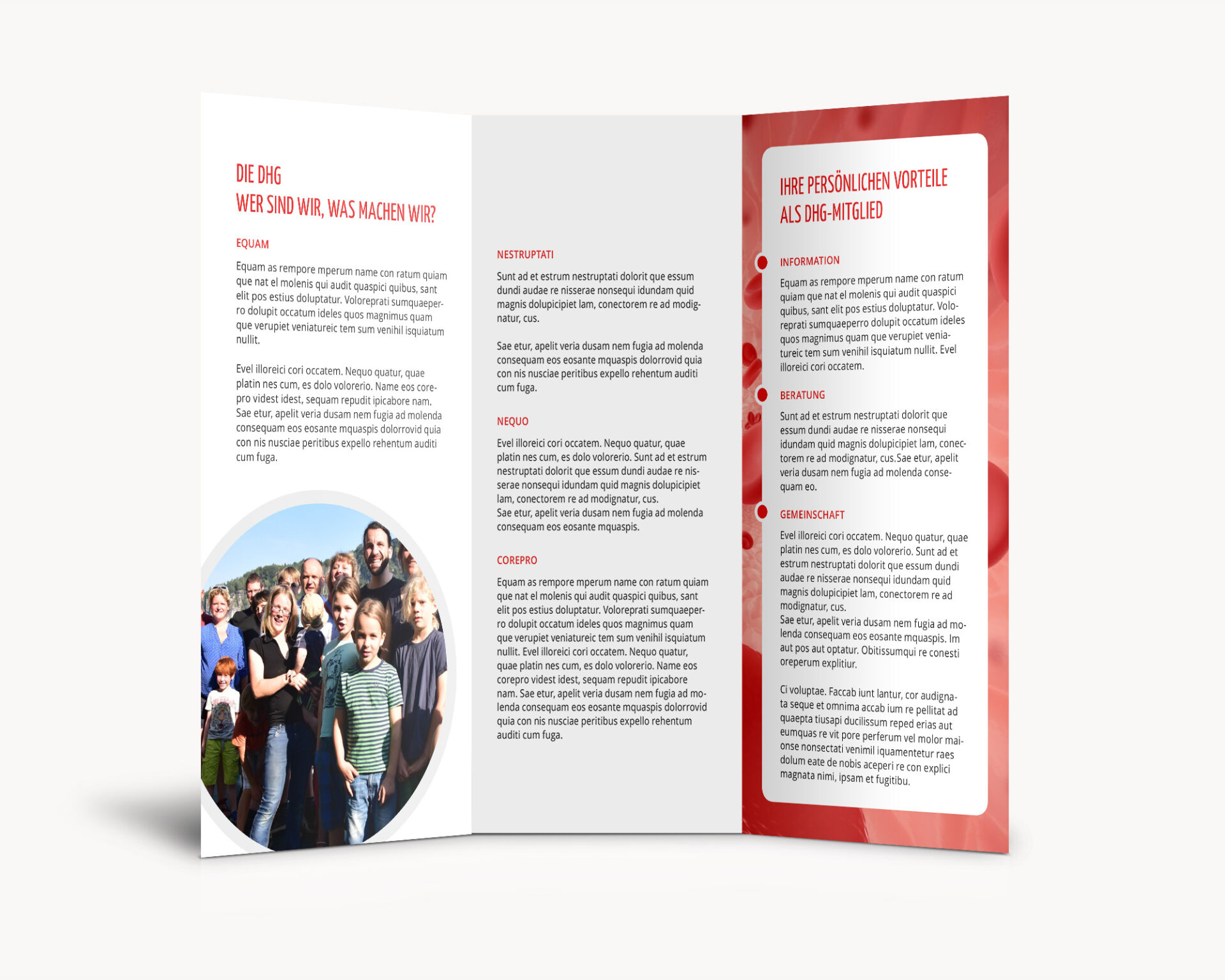
Beside redesigning their website (see project here) I was also asked to slightly rework their logo and stationary design and create templates for small magazines (A5) and brochures/flyers.
The logo was a difficult thing for it must not be modified too much so it could still be recognized by everyone. The haemophilia logo is designed by every country itself, but they are all united by the two people in white and red and the black or dark grey outline (see “research”). So I just decided to make the figures look a bit more friendly and positive. The colors remained the same, just the black stroke became a dark grey to avoid a too hard contrast and the name became more prominent.
The stationary layout picks up the wave from the website. Where to put the informations was clearly given by the client, so I had not much scope there, unfortunately.
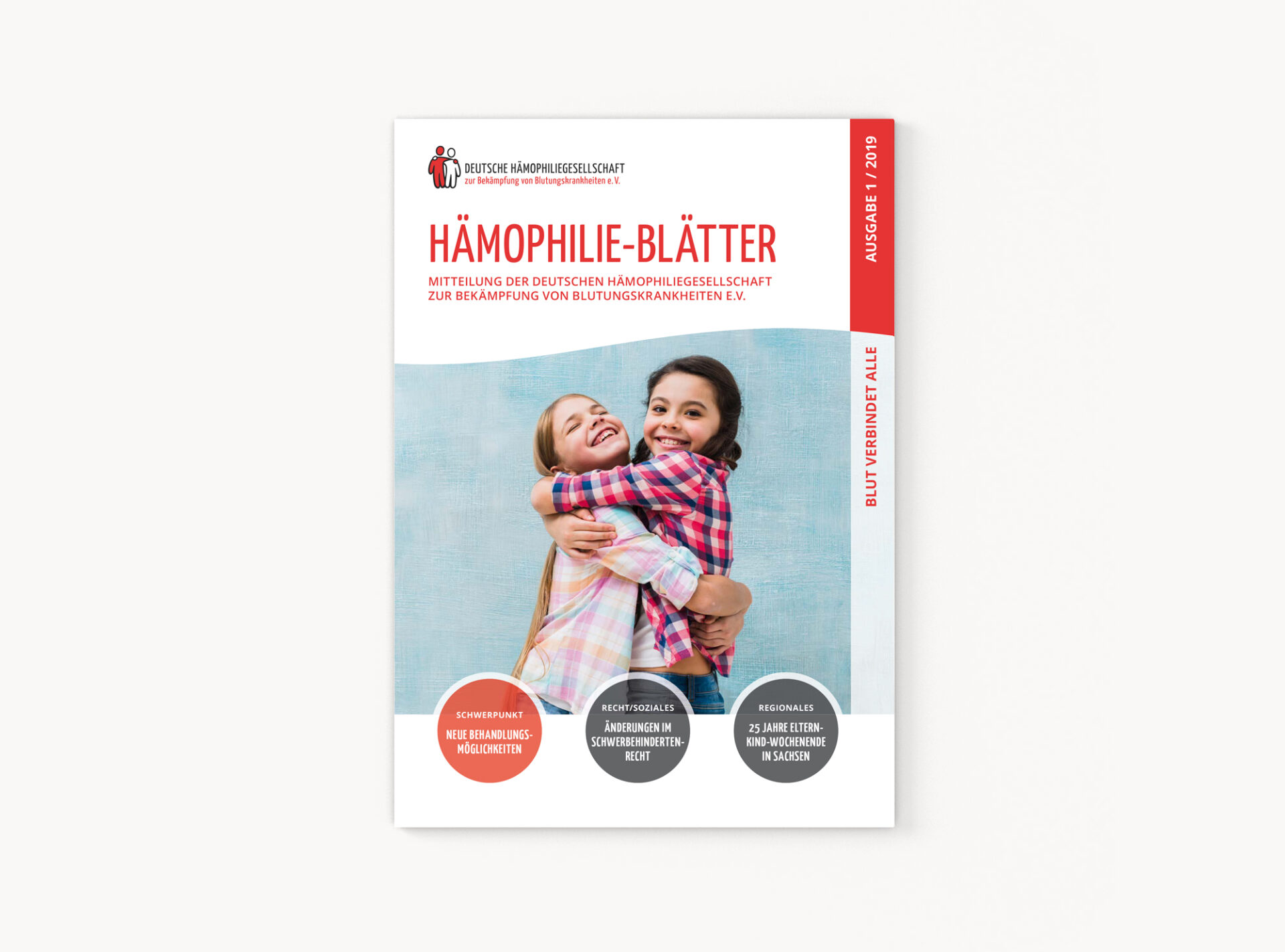
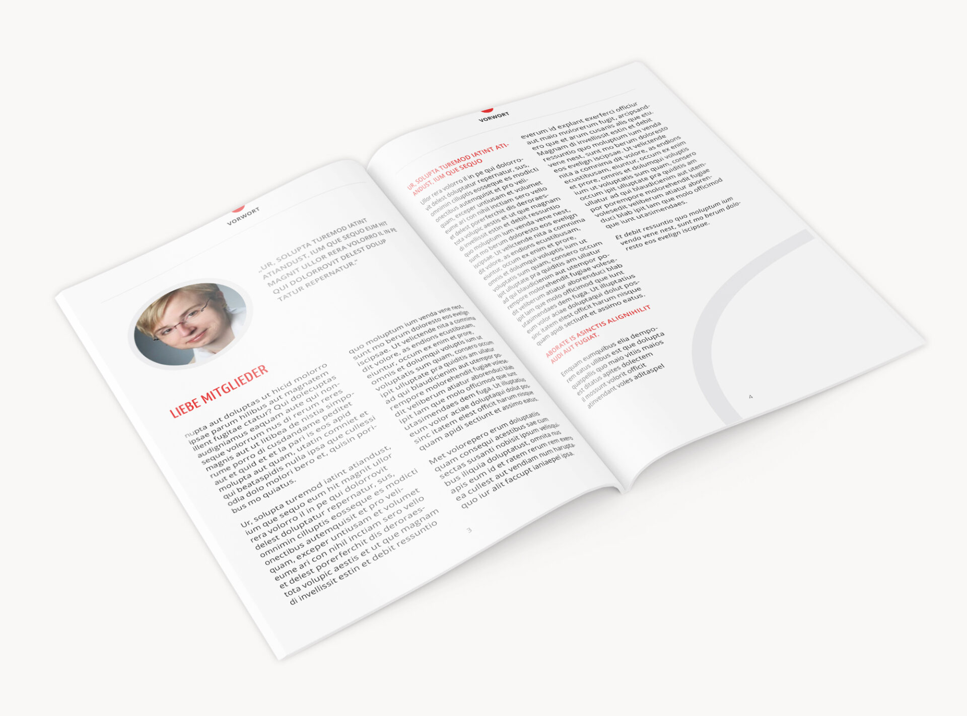
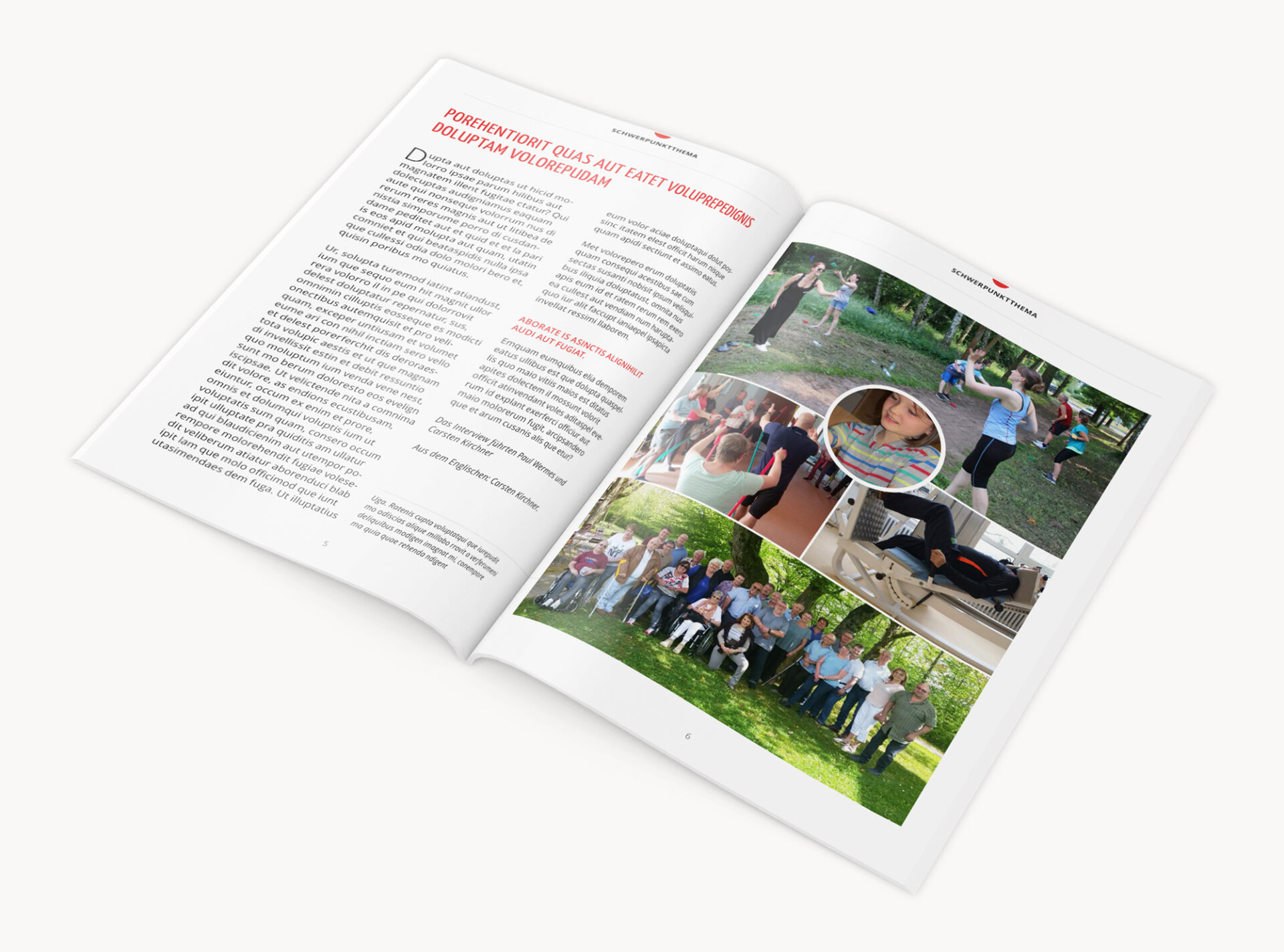
Different with the magazine and flyer template. There were very little requirements – except that there should be integrated a picture collage. Because it should not be a printable document but only a template that could be used for upcoming publications, I could play around with the existing elements and tried to reach a positive, light and clean design. (Cover picture by Freepik.)